See Ho
COMMERCIAL PROJECT
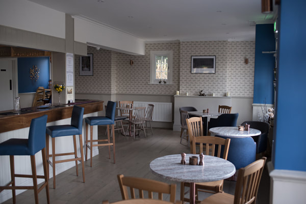
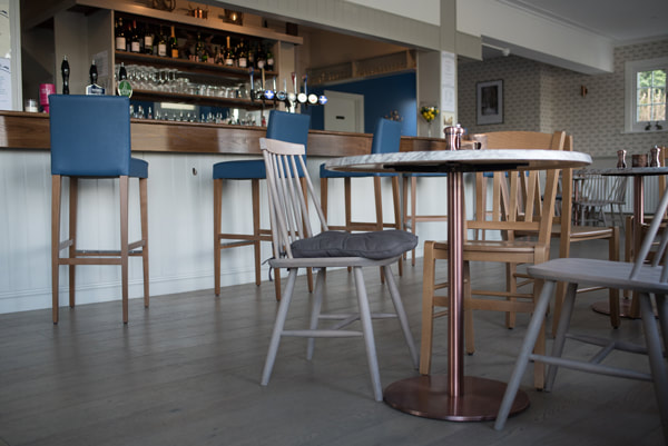
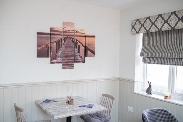
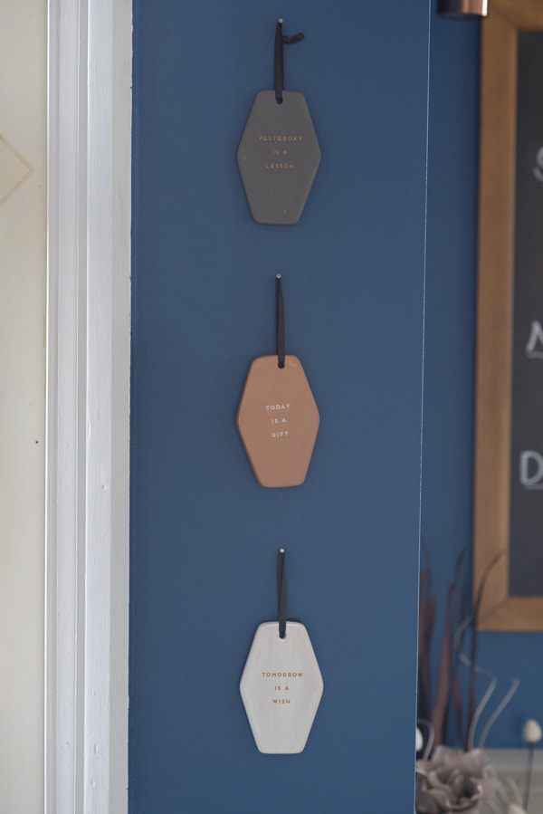
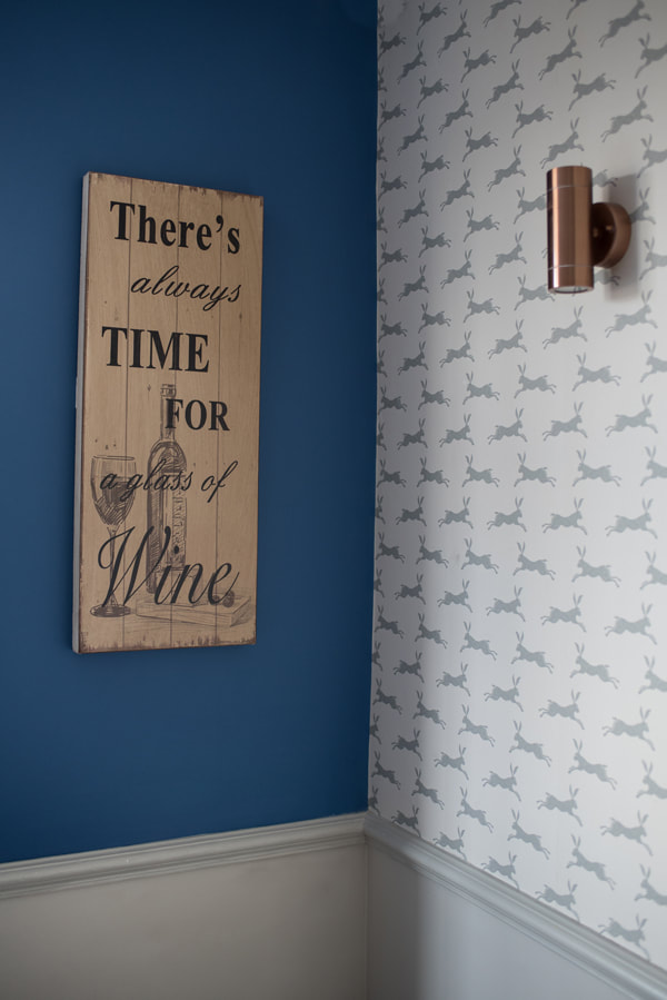
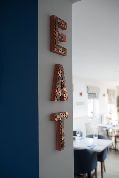
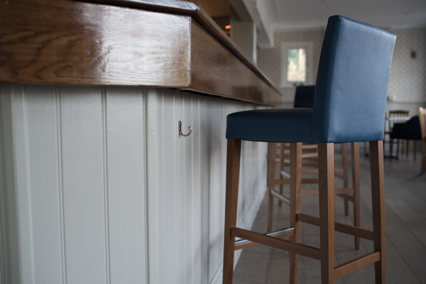
The See Ho had recently changed hands and was being developed – with a new area built to the side of the existing pub. The whole space was being renovated to give it a new lease of life. The dining area was expanding into the new light filled extension; and the existing bar, front seating area and kitchen were to have a complete overhaul. The new owners were very keen to use blue in the scheme – not a typical choice for a pub. As blue can make a space feel cool – I used richer darker tones of blue with warm neutrals, and paired it with copper and wood to add warmth to the scheme. The copper and blue work beautifully together and create quite a fun, dynamic scheme. The new wood floor replaced the old, smelly carpet. New furniture to meet commercial specifications was purchased throughout. I had some of the dining chairs upholstered for a bespoke look – and chose a dogtooth pattern combined with a plain fabric to add interest to the space and prevent too much block colour. The hare wallpaper was chosen in a blue colour-way to tie in with the Pub’s hare logo.
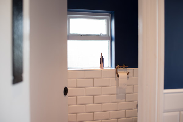
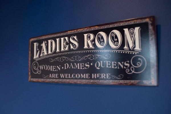
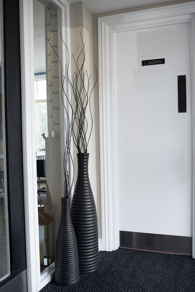
In the toilet facilities I used a classic white metro tile but paired it with a dark blue paint colour and more copper accents to give the space an updated twist. New commercial flooring – but in a hot pink – was also used in the ladies with a more sedate blue used in the mens!
In the toilet facilities I used a classic white metro tile but paired it with a dark blue paint colour and more copper accents to give the space an updated twist. New commercial flooring – but in a hot pink – was also used in the ladies with a more sedate blue used in the mens!